Red tiles on a map, representing Local Government Areas in Queensland. The LGA of Brisbane is highlighted in a darker red colour.
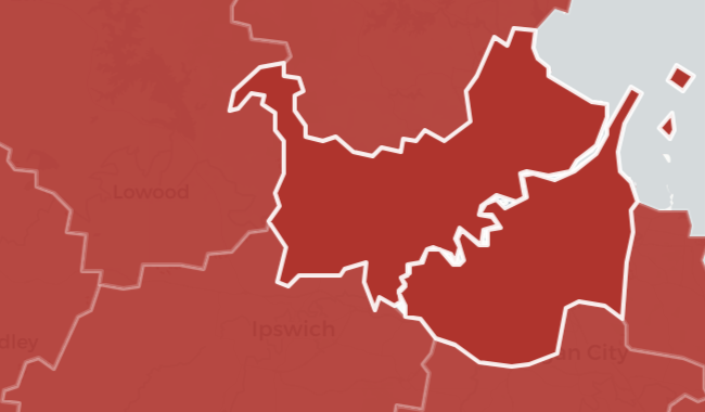
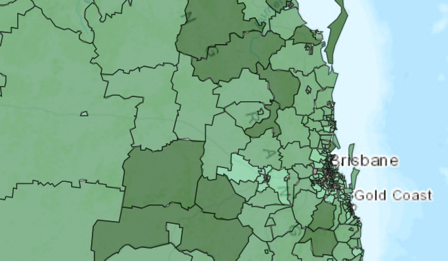
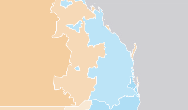
Climate Justice Observatory

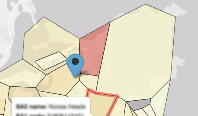
Explore climate vulnerability in your postcode in Queensland.
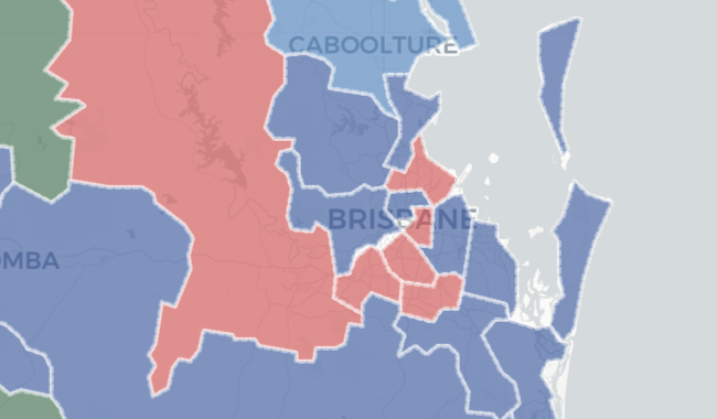
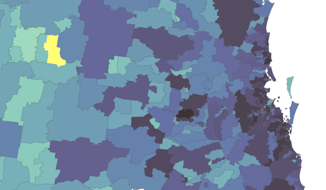
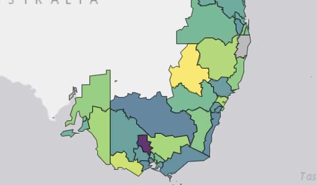
Launch app
Background of the a calm bay with a forested island in the background. In the foreground, a frosted pane with Griffith University's Logo of a book with the words 'Griffith University, Queensland Australia', and underneath, the RIDL logo with the words RIDL Relational Insights Data Lab, Making Data Matter. Both logos are in white on an aqua background.
Ecotourism Queensland

Explore DSpark mobility data to Ecotourism spots in Queensland.

Launch app
Background is a map of the world with countries in white and oceans in grey. The map is centered on South-East Asia. The bottom part of India is visible and coloured dark green. The bottom half of China is visible an coloured orange. The whole of Vietnam is visible and coloured dark blue, and the majority of Indonesia is visible and coloured light blue. Green circles with numbers in them in India and China represent diplomatic missions in the country. A red pin icon with a government building in Vietnam represents the consulate there.
Engage Asia

Explore ties between Australia and select countries in Asia.

Launch app
Background is a map of Commonwealth Electorates in Queensland, centered on Brisbane. Locality names, major roads and rivers can be seen. In the foreground, slightly transparent polygons represent each Electoral District. They are coloured by party; red represents the Labor Party, dark blue the Liberal Party, dark green the Nationals Party, and light blue the Liberal National Party of Queensland.
Federal Election Seat Explorer

Explore seats in Queensland Federal electorates in 2022.

Launch app
The coast of Queensland is shown. Each postcode in the picture is coloured from light green to dark blue to purple to black to represent the number of Australians claiming a tax deduction on a donation per postcode. Darker colours represent more persons donating. A single postcode is yellow, indicating that it has been selected.
Giving in Australia

Explore statistics on charitable donation in Australia.

Launch app
A very light grey map of south-east coast of Australia is shown, with the surrounding ocean a darker gray. The map of Australia has several coloured shapes indicaitng employment regions in shades of green, yellow, and purple.
Labour Market Insights

Explore employment statistics in Australia.

Launch app
A map of the coast of Queensland with dark grey representing the ocean. Blue and purple areas on the land represent zones of NAPLAN achievement.
NAPLAN Achievement

Explore rights-based NAPLAN achievement in Australia.

Launch app
A very blurred image of lines of black text on a white background. Blurred orange icons and text can be seen on the right side of the image.
NDIS Recommendations

Explore NDIS Review recommendations.

Launch app
In the background, a very light grey map of Peregian Springs in Queensland, with the ocean in a darker grey.
              In the foreground on land, there are shapes with black borders in shades of yellow, orange and red, indicating Statistical Areas 1. A blue pin icon with a black dot inside indicates an evacuation area. 
              In the bottom left-to-center, a white caption box has some blurred, illegible text in it.
Prepare and Respond

Explore movement data during crises in Peregian Springs.

Launch app